Tangled In Blue
Color vision relies on cone pigments that detect red, green, and blue light, which the brain processes into thousands of colors. I was diagnosed as a child with Strong Protan (Protanopia), a form of red-green color blindness that reduces sensitivity to red light. As a result, I see only 2–3 distinct hues instead of the seven typically seen by those with normal color vision.
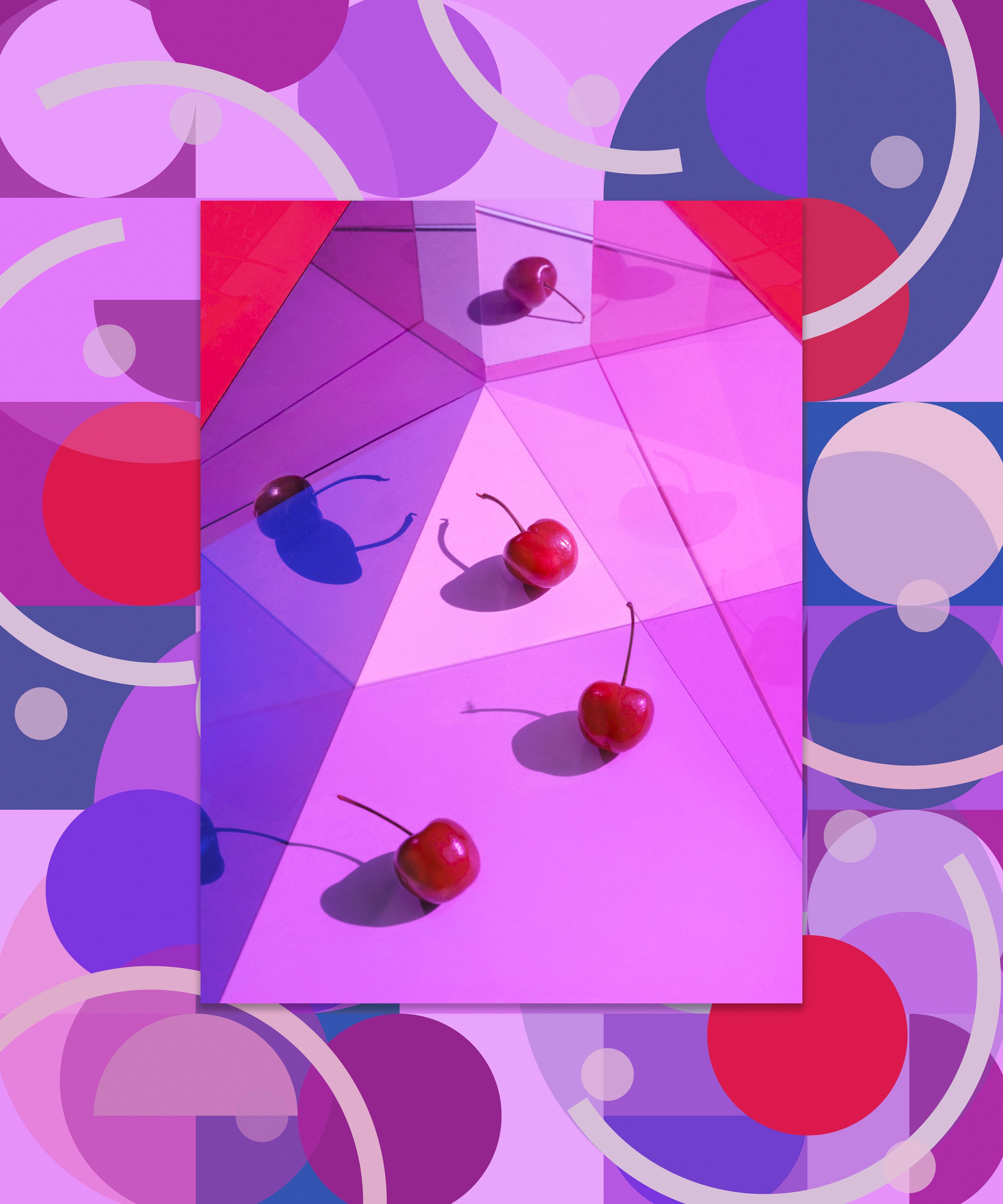
People are often surprised when I say I'm color blind. Although Protan color blindness poses challenges, especially as a photographer and creative director, it has also shaped how I see and create. Struggling to distinguish blues from purples, greens from browns, and pink from gray pushes me to explore color in unexpected ways.
Drawing inspiration from the color and light principles of Bauhaus Design and the Munsell Color Tree—a model that organizes colors by hue, value (lightness), and chroma (intensity) — I reinterpret the Ishihara colorblind test and create new patterns, carefully considering the hues, values, and chroma I perceive when viewing my image. By combining image and pattern in a layered visual composition, I juxtapose colors to explore the relationship between what we see, what we believe we see, and how we recognize and perceive color. A custom-colored frame completes each piece, adding another layer to the visual tone. To further enhance the experience, EnChroma colorblind eyewear is paired with the images, helping those with red-green color blindness perceive a broader spectrum of colors and enrich their visual experience.